BUILDING THE ADVISOR WORKFLOW

01 — Context
Power users in a fixed-income workflow
Independent Financial Advisors (IFAs) sit between fixed-income products like corporate bonds, fixed deposits, government securities, and securitized debt instruments, and the clients they recommend those products to.
IFA's are power users who live in their tool every working day, manage portfolios across many clients in parallel and recommend instruments under both market pressure and compliance scrutiny. The brief was to design the platform IFAs would use to manage their clients, track their own recommendation portfolio, and most importantly make recommendations themselves.
The recommendation flow turned out to be the heart of the product, and the place where most of the design judgment got spent.
02 — The Real Problem
Different mental models, same destination
HOW MIGHT WE
…design a recommendation flow that supports the different ways advisors actually think about recommendations, without forcing them into one mental model?
We can identify 2 key friction points:
One. Advisors don't always start from the same place. Sometimes a new bond arrives in inventory and they think "who should I recommend this to?" which is product-first thinking. Sometimes a client has cash to deploy and they think "what's the right product for them right now?" which is client-first thinking.
Two. Recommendations aren't always one-to-one. An advisor might recommend a single bond to fifteen clients, or assemble a multi-instrument portfolio for a single client, or do both at once during a high-activity week. The flow had to handle all of these without becoming three separate features users had to learn.
03 — Role & Constraints
What I owned, and what was in the way
Role:
Product Designer
Timeline:
Tight MVP1 timeline driven by business deadlines for advisor onboarding.
Research:
A four-hour collaborative working session with two IFAs alongside the business and product teams, capturing requirements and proposed UI directly from the people who would use the product daily.
Constraints:
The IFAs' proposed UI was functional but visually cluttered, it was readable to them through familiarity, hard to reason about as a scalable system. MVP1 had a hard scope ceiling: certain features the IFAs flagged as important (block units, a full suitability questionnaire) couldn't fit in the first release timeline, even though everyone agreed they mattered. The focus was to to ship a product that had to be operational from day one.
04 — How I Approached It
Five decisions, in order
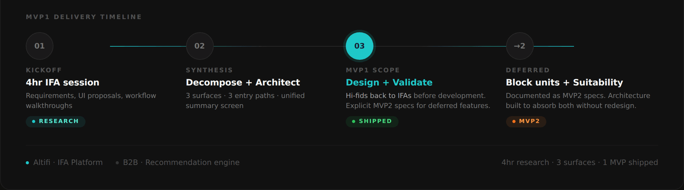
The work came down to five decisions → how to use the collaborative session, how to decipher the brief, how to design the recommendation flow, how to design the loaded summary screen and what not to ship in MVP1.
Decision 01
Four hours with two advisors & what I did with what they gave me
The project started with a four-hour working session with two IFAs alongside the business and product teams. Long-form working sessions with power users are uncommon in B2B design, most projects survive on 30-minute interviews. I wanted to use the time deliberately. We collected requirements, watched the IFAs sketch what they thought the product should look like, and asked them to walk through actual recommendation scenarios from their workday.
What they proposed was structurally sound but visually cluttered. They had grouped everything they needed onto dense screens - client lists, product details, recommendation actions, portfolio status and they had no hierarchy between them. To them it was usable, because they had years of muscle memory with the cluttered UI. To anyone new to the team, it would have been very difficult challenge to get used to.
The pull was strong to just build what they had asked for. Four hours of input, two real users, full alignment from business and product, the path of least resistance was to faithfully execute the brief but it was difficult for me to get past the UX sacrifice, so I take what they had given as evidence of the structure underneath, and rebuild the product as a cleaner version of the same logic.
An organised replica of my meeting notes from the session below:

Decision 02
Decomposing the product into three surfaces
What the IFAs had described as one cluttered tool was actually three distinct jobs:
Client Management - The surface where the advisor manages their book. List of clients, ability to add individual clients or bulk-import them, and per-client detail views showing basic details, tags, recommendations made to that client, and currently invested products.
My Dashboard - The surface where the advisor manages their own business. Total recommended portfolio across all clients, returns generated, amount invested and a breakdown by instrument type such as Bonds, FDs, SDIs, G-secs. This is the advisor seeing themselves as a user, not just a client manager.
Recommendation Flow - The surface where the actual work happens. The flow that converts an advisor's intent into a recommendation sent to one or more clients.
Splitting the product this way meant each surface could be designed for the kind of work it actually supported, instead of every screen carrying the cognitive weight of every job at once.

Decision 03
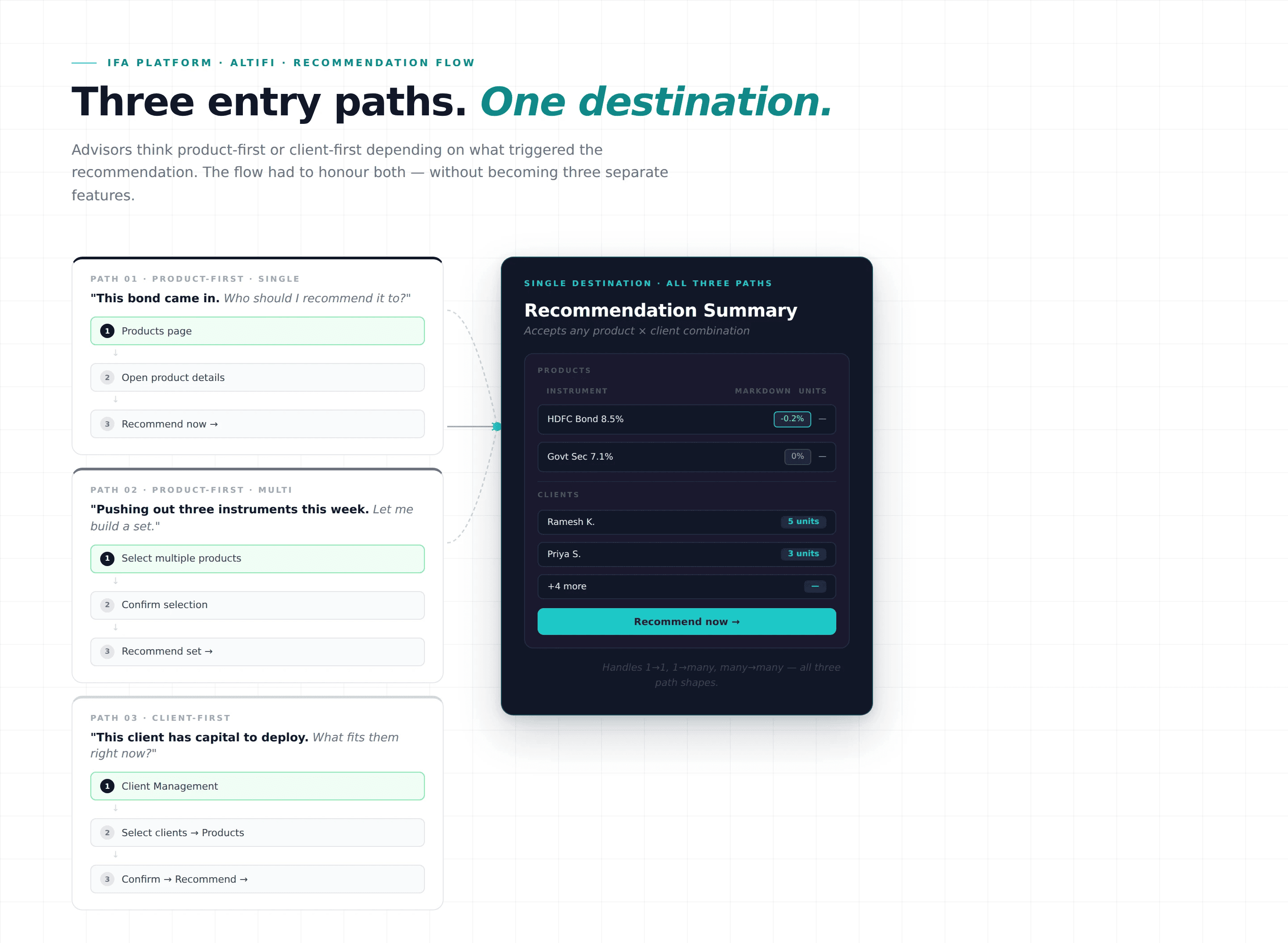
Designing the recommendation flow around three entry paths
The recommendation flow had to support three different mental models, because advisors think about recommendations from different starting points depending on what triggered the recommendation in the first place.
Path 1 - Product-first, single product:
"This bond came in. Who should I recommend it to?" The advisor opens a product, hits Recommend, and lands on a recommendation summary, select one or many clients from a client table, and submit.
Path 2 - Product-first, multi-product:
"I'm pushing out three new instruments this week. Let me build a recommendation set." The advisor selects multiple products from the Products page using card-level checkboxes, confirms the selection, and lands on a recommendation summary that shows all products in a table and clients selected from the client table. Same destination as Path 1, different entry.
Path 3 - Client-first:
"This client has capital to deploy. What should they get?" The advisor starts from Client Management, selects one or more clients, hits Recommend Products, lands on the Products page with their selection carried forward, picks products, and lands on the same recommendation summary, clients pre-populated, products pre-selected, all parameters editable.
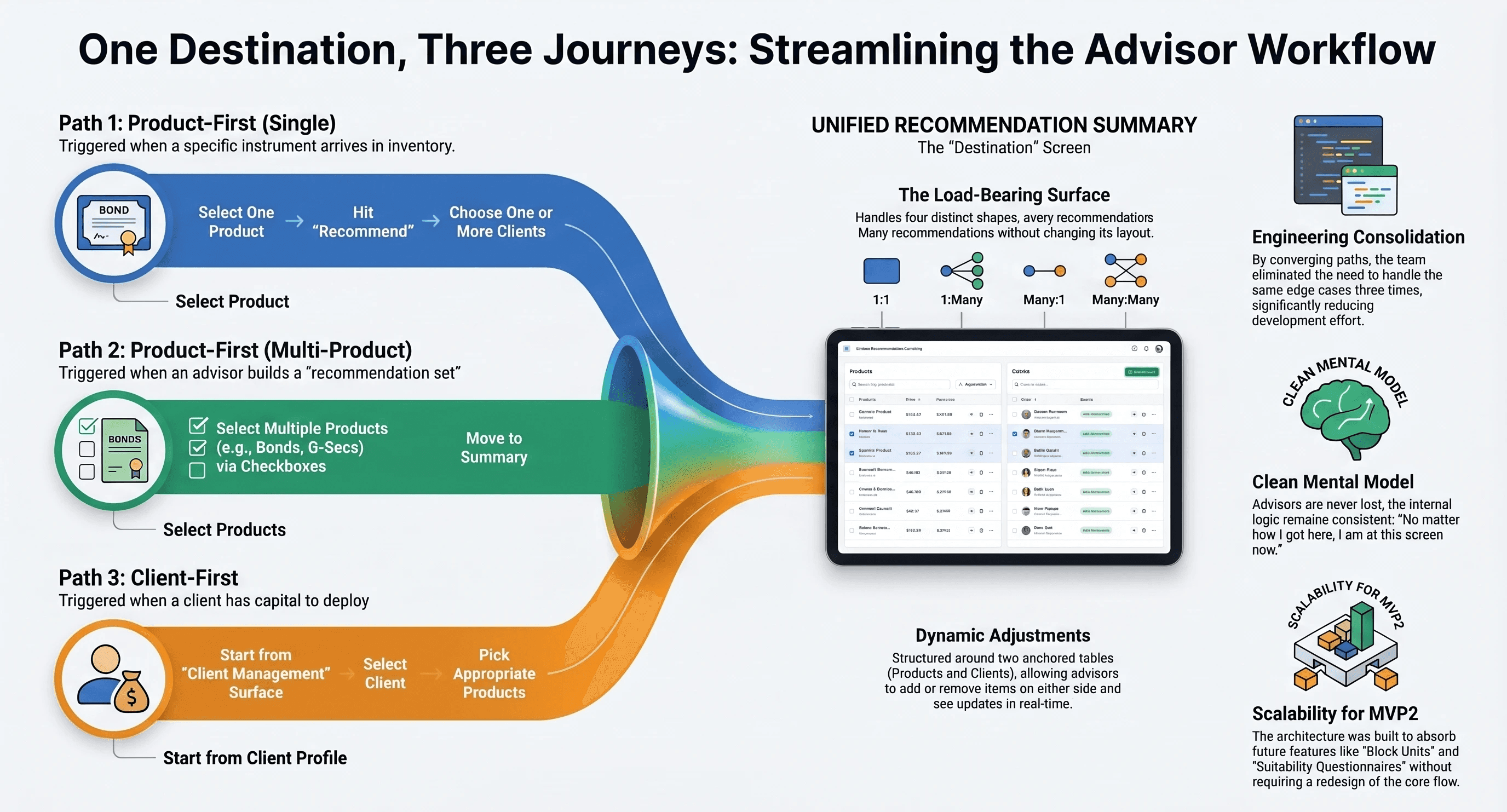
The key design move was that all three paths converged on the same recommendation summary screen. The summary didn't care which entry the advisor used, it accepted any combination of products and clients and let the advisor adjust the recommendation from there. This meant the flow was three entry points, not three flows. Edge cases reduced. Engineering effort consolidated. The advisor's mental model will stay clean: "however I got here, I'm at this screen now."
Infographic on my approach and the three entry paths for recommendation below:
Decision 04
The recommendation summary as the load-bearing surface
The recommendation summary was the most-designed screen in the project. It had to handle every combination the three entry paths could throw at it - one product to one client, one product to many clients, many products to one client, many products to many clients. The interaction model had to scale across all four shapes without forcing the advisor to learn four different layouts.
The screen was structured around two anchored sections: a products table at the top and a clients table below. The advisor could move between them, adjust either side, and see the recommendation update without leaving the screen.
Decision 05
The MVP scope call - what didn't ship and why
The IFAs flagged two features in the working session as important to their workflow: a block units capability (reserving units of a product for specific clients before recommending) and a suitability questionnaire (a structured intake that would inform recommendations against the client's risk profile and goals). Both were genuinely valuable. Neither was going to fit MVP1 under the timeline.
The scoping call was to ship the three-path recommendation flow without these two features in MVP1, with a documented commitment to bring both into MVP2. An operational MVP that gets advisors recommending products is more valuable to the business than a more-complete tool that ships a month later. Block units and the suitability questionnaire would extend the flow's quality, but the flow itself was usable without them.
05 — The Core
The judgment call
The harder moment in this project wasn't a stakeholder negotiation. It was a moment of design judgment with myself.
The IFAs I had spent six hours with had given the team a working, usable, cluttered design. They had buy-in from business and product. The path of least resistance was to faithfully execute what they had drawn and it would have shipped a working product.
But what they had drawn wouldn't have served the team's growth. It would have worked for the two IFAs in the room they had built it to match their own muscle memory. It would have worked for the team that was going to support those two IFAs day one. It wouldn't have worked for the next ten advisors onboarded, or for the engineering team that would have to extend the cluttered structure with every new feature, or for the compliance review that would have to find audit trails inside a screen that wasn't designed to expose them.
The judgment call was to take the IFAs' input as evidence of the underlying structure - three jobs, three entry paths, one shared destination and design from that, rather than to take their input as the solution and execute it. I validated the design with the same IFAs before development. They were confused at first, it wasn't what they had in mind but agreed that the structure made sense once we walked through their own scenarios in it.
They had asked for a dense single tool. What they needed was three clear surfaces that synced with each other. The two felt the same to them at the start of the project but clearly the clarity in the approach made sense after the completed UI fell in place.
06 — Outcomes
What shipped, and what the architecture absorbed
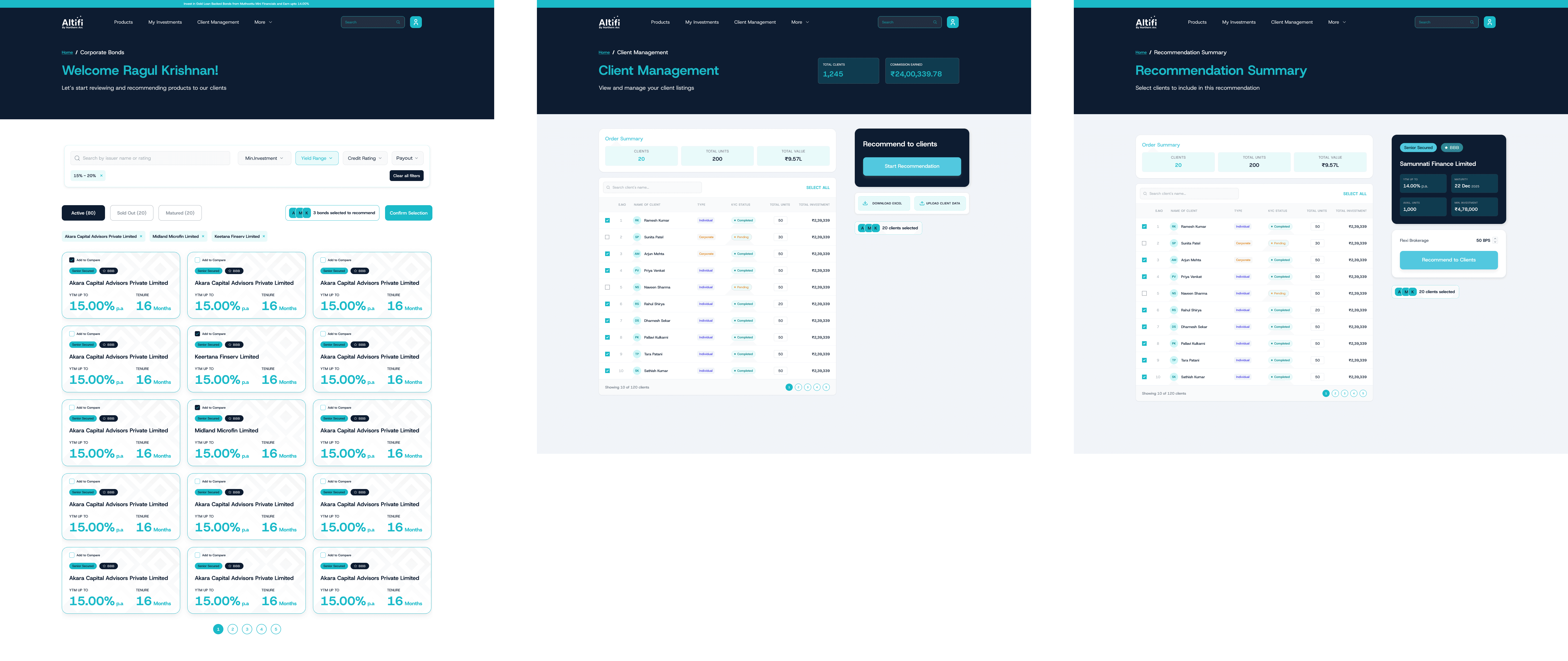
MVP1 shipped with the three-surface architecture (Client Management, My Dashboard, Recommendation Flow) and the three-path recommendation flow converging on a unified summary screen. Advisors could recommend single products to single or multiple clients, multiple products to multiple clients, and start the flow from either products or clients depending on which mental model they were operating in.
Block units and the suitability questionnaire were documented as MVP2 specs and queued for the next release.
The most useful outcome of the structural decision was that MVP2 didn't require redesigning the recommendation flow to add the deferred features. Block units and the suitability questionnaire could slot into the existing architecture without disturbing the three entry paths or the summary screen. The MVP1 design had been built to accommodate them.
07 — What I'd Do Differently
Three lessons, in order of weight
01 User input is evidence, not specification.
The IFAs had given us four hours of rich input, and the most useful thing I did with that input was dissect it rather than execute it. What users describe as their solution is often the most familiar form of their need, not the best one. The job is to read past the described solution to the underlying structure, without dismissing the user, because the underlying need is real even when the proposed solution isn't.
02 Design what doesn't ship, as carefully as what does.
Block units and the suitability questionnaire mattered. Documenting them as MVP2 specs alongside MVP1 design meant the deferral was explicit and the next sprint had a head start. If I'd left them as "we'll figure it out later," it would add to the team's discovery time three months on.
03 Convergence reduces edge cases.
The decision to have all three entry paths land on the same recommendation summary screen eliminated a class of edge cases, our team would otherwise have had to handle three times. I'd carry this principle into any flow with multiple entry points.
Want to know more about Altifi? Check out https://www.northernarc.com/altifi