ONE PRODUCT LANGUAGE FOR FINANCIAL WORKFLOWS

01 — Context
One Product Becomes Many
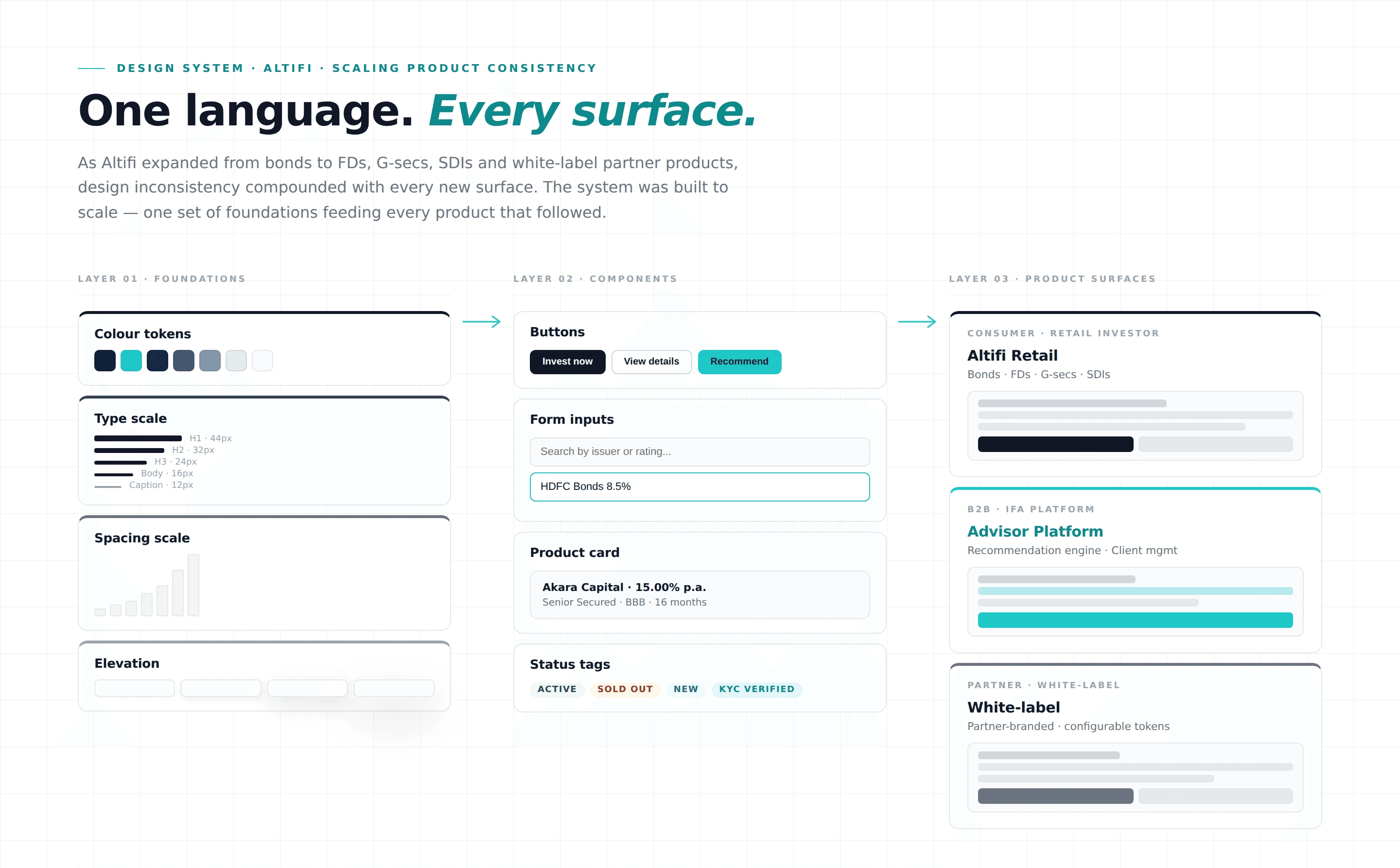
Altifi began as a focused fixed-income investment product for individual investors and rapidly expanded into a multi-product platform: starting with bonds, then Mutual Funds, Fixed Deposits, Government Securities, and white‑labeled partner solutions. As product lines multiplied, so did configuration complexity, brand variants, and regulatory nuances. To scale responsibly and consistently, we needed a cohesive, extensible design system that could serve retail and partner experiences.
The shift to a multi-product, white‑labeled platform increased variability and coordination costs. A unified system became essential to keep quality, speed, and compliance aligned.
To meet these challenges, a cohesive design system was identified as the solution. As the first hire for this project, my responsibilities ranged from undertaking extensive research to advocating the design system to stakeholders, creating a strategic plan, and foregrounding user needs throughout the design process.
02 — Our Team
Who Were In The Room
1 Product Designer
1 Product Manager
1 Senior Software Engineer
2 Associate Software Engineers
03 — Problem
Real Cost Of Inconsistency
Design a robust design system that bridges the gap between design visions and coded realities at Altifi. The system needed to support multiple product categories, brand themes for partners, and accessibility and compliance constraints without slowing delivery. The objective was to accelerate product launches while preserving brand consistency.
04 — Research
Auditing Before Building
In addressing the challenges, it wasn’t enough to merely identify there was a problem; we needed to delve deep into its nuances and contours. The goal was to pin down the specifics of what was going wrong in transitioning from design mocks to coded interfaces.
During the audit, we mapped inconsistencies across core journeys like discovery, KYC, purchase flows and investment portfolio view.
Key findings
Eyeballing Over Precision: Our engineers, in the absence of a defined system, often resorted to eyeballing design values. This makeshift approach led to discrepancies in the final output.
Inconsistent Colour Use: A staggering revelation was the discovery of over 15 different shades of our brand's primary colour - “Space Blue”. Such inconsistency diluted our brand's visual identity.
Spacing Disarray: Instead of following a set spacing system, varied values were used across the interface, affecting visual hierachy.
Text Styles: A fundamental design principle like line-height was misunderstood or misinterpreted by many, text styles were duplicated and misapplied indicating a knowledge gap that needed bridging.
Drawing inspiration was essential. I turned to study other design systems:
Studying these mature systems offered insights into crafting a scalable and consistent design language tailored for Altifi by Northern Arc.
Based on the research, it was clear that we need to start from the core. Before building components, we need to develop a robust “token system."
Guiding Principles
Resolve existing design and interface issues.
Streamline processes to let teams design and develop faster.
Create an intuitive system for newcomers, be they engineers or designers, to easily understand and adopt.
Implementation of the Design Token SysteFrom our comprehensive research, we identified a variety of style attributes that had the potential for tokenisation, encompassing everything from colors, typography, spacing, shadows, and beyond.et, grounding our decision in the audit results and our core principles, we prioritized the following elements because these covered more than 70% of the styles:
Color: Aimed to unify brand, semantic states, and data visualization palettes with WCAG compliant contrast.
Typography: An effort to standardise text styles, ensuring they're rendered uniformly across varied platforms and devices.
Spacing: Introduced to align both designers and engineers on a unified spacing framework, eliminating random values that disrupted visual flow.
Name convention
Before diving deep into the tokenisation process, our foundational move was to establish a scalable naming convention.
Terminology is key to understanding design tokens and the concepts behind the token system. These are foundational terms that describe how to use tokens, and how they relate to each other.
Given the varied nature of style properties, it was crucial to devise a naming standard capable of accommodating complex token names. This systematic approach wasn't just limited to design tokens, it also paved the way for naming components. Notably, as components can manifest varying visual appearances based on their associated tokens, this convention ensured clarity and consistency across the system.
Classification naming structure
The name will have this structure
category - type - property - sub property - state
Category
This is the top level of classification of the tokens and components.
e.g., Color, Text, Button, Input etc.
Type
Some properties like color and text have more impact on the context of component as compared to properties like cornerradius and borderthickness. Thus, to create better mapping of there use case a second level of categorisation is required, which is type.
In the case of components like button this level of classification can facilitate prioritisation.
e.g.,
for button : normal, primary, secondary, alt etc.
for text : h1, h2, body, button, label, tag etc.
Property
This level of classification provides more context for the use of the token or component.
e.g., For text component type button, there are 2 items primary and secondary.
Sub Property
This part of the name deals with the properties like size in case of components like button, and variations in case of tokens like color.
small → medium → large
State
A component on the UI is either intractable or not. The components which could be interacted with can have these stages of interaction
default → hover → active → disabled
Examples:
Token Name | Category | Type | Property | Sub Property | State |
| color | brand | overlay | ||
| color | background | primary | ||
| text | fontsize | lineheight | ||
| cornerRadius | default | bottomLeft | ||
| color | button | primary | background | active |
Component Name | Category | Type | Property | Sub Property | State |
|---|---|---|---|---|---|
| button | primary | default | ||
| input | text | prefix | active | |
| tab | tertiary | large |
Colour
Initially, our application code featured 95 distinct colors. These were categorized as follows:
Brand and accent colors: 75
Shades of grey: 20
In our quest to eliminate arbitrary color choices, we devised a set of global colors. Instead of relying on aribitrary hex values, which lack context and are difficult to interpret, our global color palette offers a contextual understanding. Think of it as referring to a color by its purpose rather than a confusing code.
Global color approach made the addition of new hues to our palette instrumental. Any color that's added now has a clear place, purpose, and relationship to other colors.
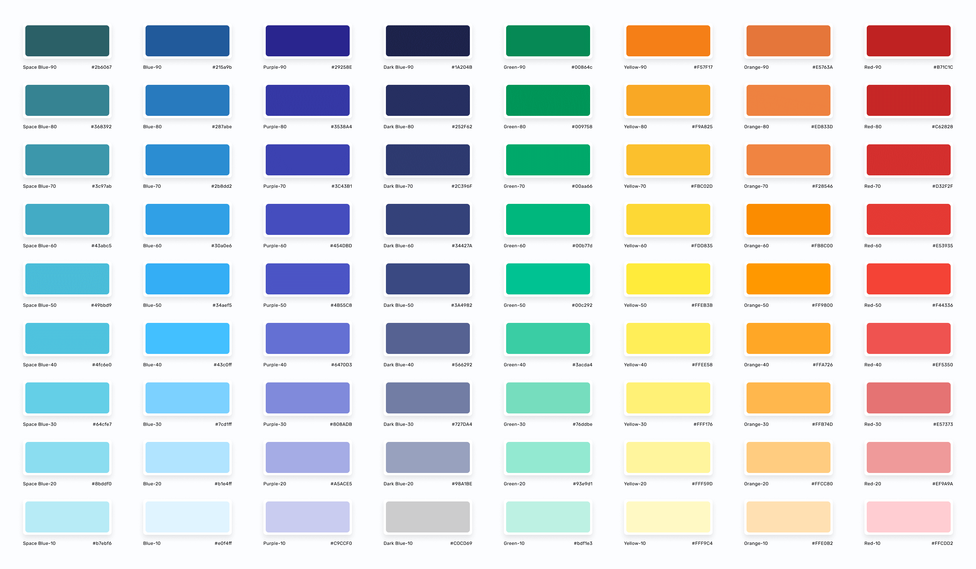
Our token system is more than just labels; it's a framework that ensures consistent application across our designs. The accompanying image breaks down the token naming and usage:
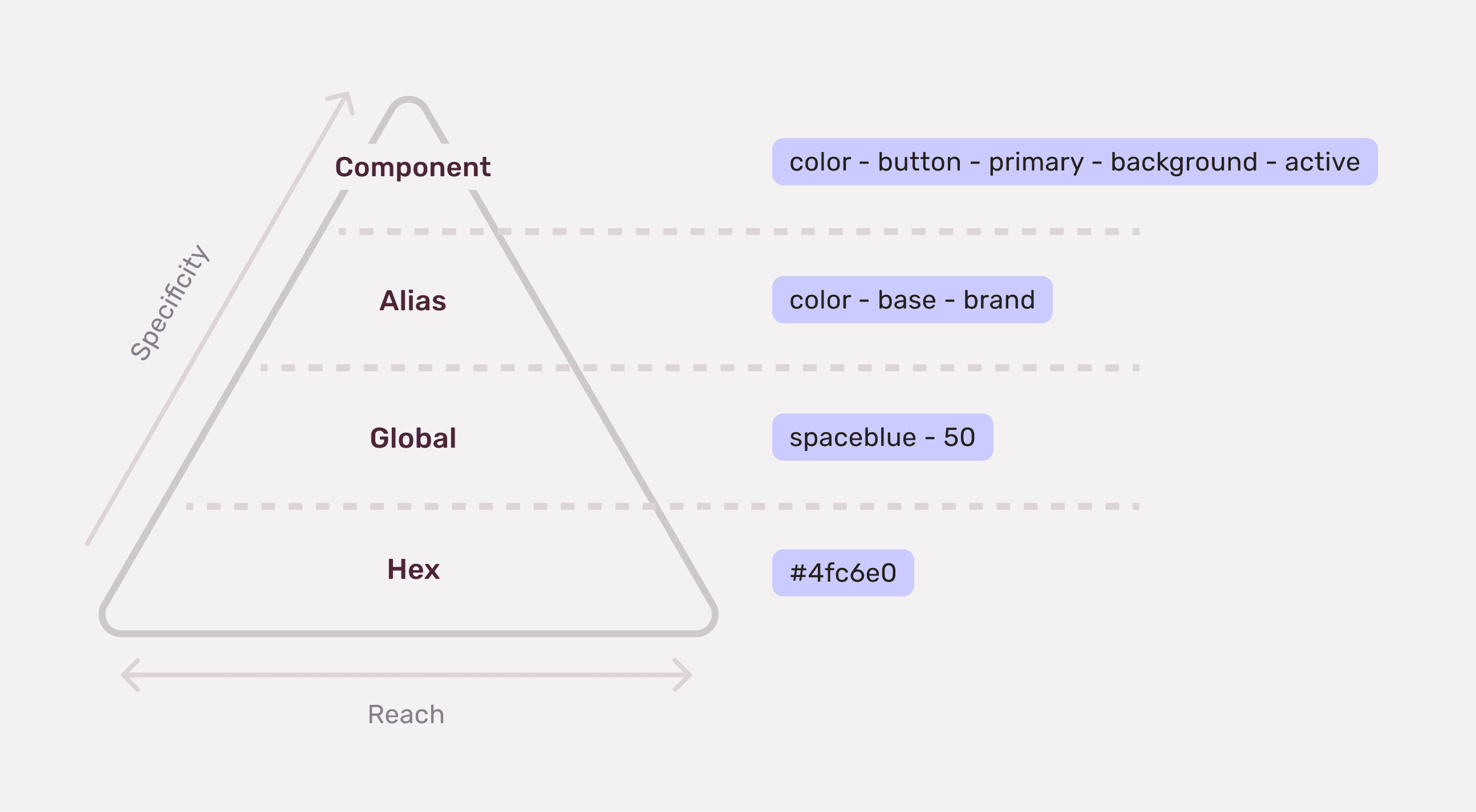
Global token
This is the foundational token, one that represents across the entirety of the design system.
Alias token
Instead of anchoring to a hard-coded value, this token points to another token, ensuring a more adaptable, brand centric system.
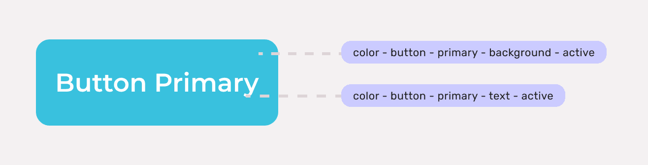
Component-specific token
As the name suggests, these tokens are tailored for specific components, bringing nuanced customization.
Accessibility
Every hue underwent a stringent color accessibility audit. Any color that didn't meet the criteria was adjusted to ensure compliance with these guidelines, ensuring our design system was both beautiful and usable by all.
Our commitment wasn't just to beauty but also to inclusivity. We rigorously adhered to the WCAG guidelines, ensuring our colors were accessible.
Output
The alias tokens were made available to all designers in Figma and engineers in code.
We reduced the color palette down to a concise set of 26 colors alias tokens from 95.
light: {
colors: {
'color-base-brand': globals.colors['spaceblue-50'],
'color-base-info': globals.colors['darkblue-90'],
'color-base-warning': globals.colors['yellow-50'],
'color-base-error': globals.colors['red-50'],
'color-base-success': globals.colors['green-50']
},
content: {
'color-content-primary': globals.colors['darkblue-90'],
'color-content-secondary': globals.colors['darkblue-40'],
'color-content-tertiary': globals.colors['grey-60'],
'color-content-brand': globals.colors['blue-50'],
'color-content-info': globals.colors['darkblue-70'],
'color-content-error': globals.colors['red-50'],
'color-content-warning': globals.colors['yellow-70'],
'color-content-success': globals.colors['green-50'],
'color-content-constant': globals.colors['grey-00'],
'color-content-link': globals.colors['spaceblue-60'],
},
background: {
'color-background-primary': globals.colors['grey-00'],
'color-background-secondary': globals.colors['purple-10'],
'color-background-tertiary': globals.colors['grey-10'],
'color-background-brand': globals.colors['spaceblue-10'],
'color-background-info': globals.colors['blue-10'],
'color-background-error': globals.colors['red-10'],
'color-background-warning': globals.colors['yellow-10'],
'color-background-success': globals.colors['green-10'],
'color-background-modal-backdrop': 'rgba(26, 26, 26, 0.6)'
},
border: {
'color-border-default': globals.colors['grey-20'],
'color-border-hover': globals.colors['grey-30']
},
shadow: {
'color-shadow-default': '0px 2px 8px 0px rgba(0, 0, 0, 0.2)'
}
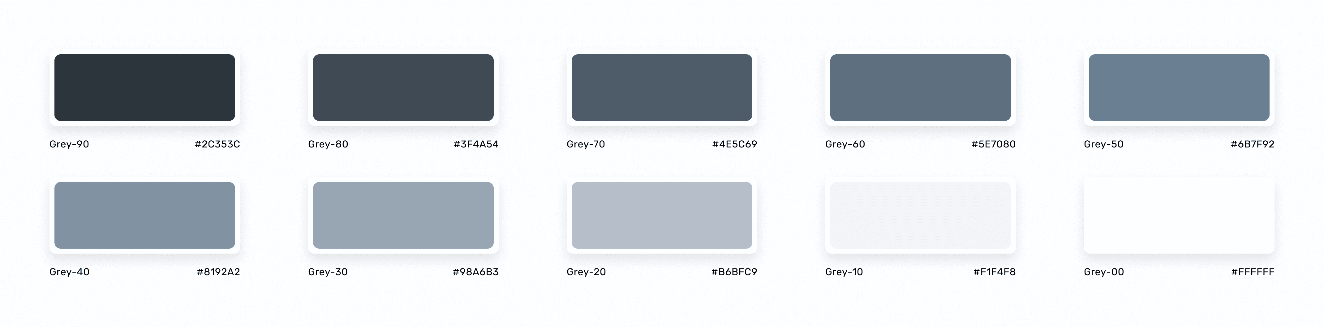
Furthermore, the original grey shades (20 shades), were now distilled to a harmonized set of 10 greys.
All the grey alias values were derived from the 10 grey globals colors, demonstrated below
Spacing
During the audit, it was clear that there was no unified spacing strategy in place. Spacing values were being used arbitrarily, with numbers like 5px, 10px, 13px, and 17px seen throughout the design.
To bring consistency, we introduced a 4px grid system. This means the smallest value for spacing would be 4px or none at all. Here's how the spacing values were standardized:
spacing: {
'spacing-zero': '0px',
'spacing-xs': '4px',
'spacing-s': '8px',
'spacing-m': '12px',
'spacing-l': '16px',
'spacing-xl': '24px',
'spacing-xxl': '32px',
'spacing-xxxl': '48px'
},
However, just having a set of standardized values wasn't enough. It was crucial for designers and developers to understand the application of these spacings. Based on extensive research on spacing utilizations, three primary concepts emerged:
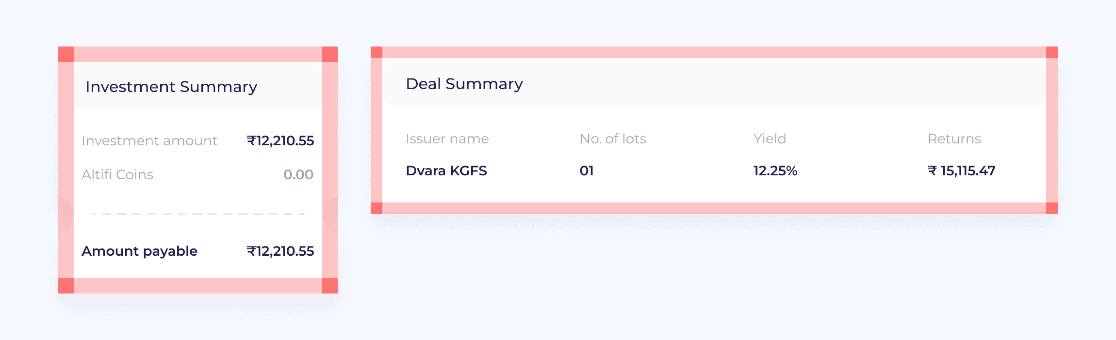
Concept 1: Inset (Square)
Insets are indentations applied to all four sides, resembling a photo frame. Its application is broad-ranging, from smaller components like compact pills to larger design elements like footers and mastheads.
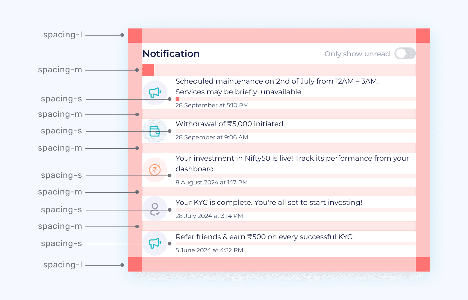
Concept 2: Stack
Considering the natural vertical scroll in most UIs, stacking becomes an important design strategy. Whether it's layering messages over headings, arranging modules, or simply placing icons, pills, and toolbars within a card, stacking is everywhere.
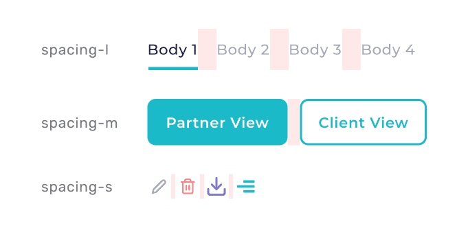
Concept 3: Inline
Elements can also be arranged inline, flowing from left to right, wrapping as needed. This arrangement is seen in elements like tags, toggles and breadcrumbs. These elements can stand alone or be stacked with others.
By providing both the standardized values and their conceptual explanations, designer and developers can make informed decisions on how to implement spacings, ensuring a well-structured interface.
Typography
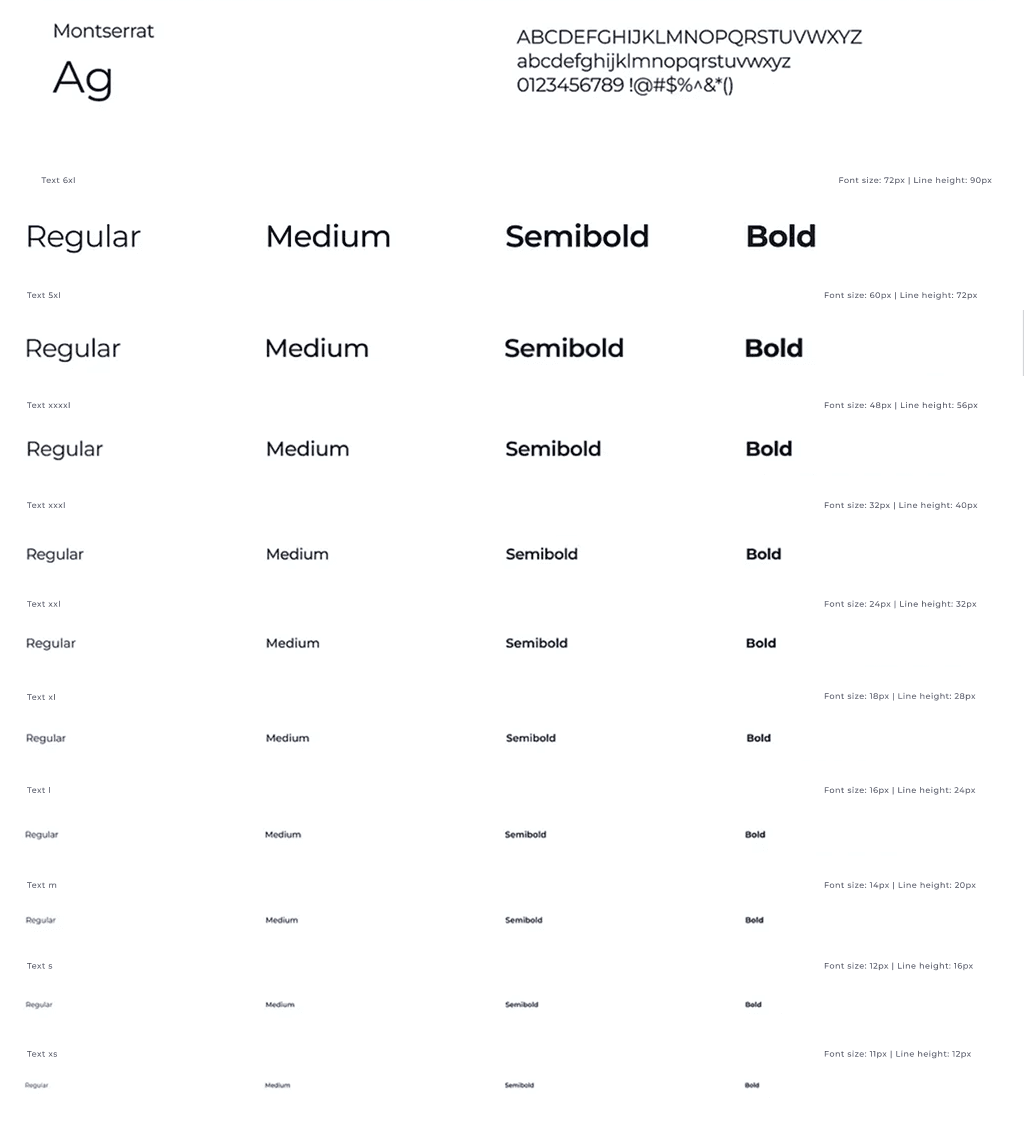
Text styling lacked consistency in the application. Fonts, their sizes, and line-heights varied, leading to visual incoherence and a fragmented user experience.
Informed by the WCAG success criterion, we devised a strategic approach to standardize text styles.
We tokenized different font sizes, line heights, and font weights and stuck to a singular text family. This structured approach allowed us to derive consistent text styles throughout the application, ensuring readability and aesthetic uniformity. This not only enhanced the visual appeal but also ensured that our designs were in compliance with accessibility standards, catering to a wider audience with varying needs.
typography: {
// font
'text-family-default':
"'Montserrat', system-ui, -apple-system, BlinkMacSystemFont, 'Segoe UI', Roboto, Oxygen, Ubuntu, Cantarell, 'Fira Sans', 'Droid Sans', Helvetica, Arial, sans-serif",
'text-family-code':
"'Montserrat Alternates', SFMono-Regular, Menlo, Monaco, Consolas, 'Liberation Mono', 'Courier New', monospace",
// font-size
'text-size-xs': '11px',
'text-size-s': '12px',
'text-size-m': '14px',
'text-size-l': '16px',
'text-size-xl': '18px',
'text-size-xxl': '24px',
'text-size-xxxl': '32px',
'text-size-xxxxl': '48px'
// line-height
'line-height-xs': '12px',
'line-height-s': '16px',
'line-height-m': '20px',
'line-height-l': '24px',
'line-height-xl': '28px',
'line-height-xxl': '32px',
'line-height-xxxl': '40px',
'line-height-xxxxl': '56px',
// font-weight
'text-weight-regular': 400,
'text-weight-medium': 600,
'text-weight-bold': 600
}
03
05 — Getting Engineers to Let Go
Challenge
One of the most pressing challenges was getting engineers on board to replace hardcoded values with the new design token values. Given our small design system team ( just me and a few engineers) it was unrealistic to think we could comb through and refactor all the code ourselves.
06 —How We Made Adoption Happen
Strategies Deployed
Leveraging UX support tickets: Every product team had a "UX score", derived from the reported UX fails on our internal JIRA support tickets Recognizing the importance teams placed on this score, I audited all UX fails (around 200) and categorized them as UI issues. By proposing fixes for these issues using design tokens, we presented a tangible solution and motivation for teams to adopt the new system.
Developer Guides: Collaborating with our engineers, we developed comprehensive migration guides. These guides served as a manual for other engineers, detailing how they could transition to using design tokens seamlessly.
Oversight on New Features: As new features rolled out, I worked closely with the respective designers, ensuring their designs incorporated and adhered to the design tokens. This proactive approach ensured that new features seamlessly integrated into our evolving design system.
Proof of Concept: Operating within our limited bandwidth, we prioritized by selecting high-traffic user flows and converting them as a Proof of Concept (POC) to utilize design tokens.
07 — What the System Unlocked
Success and Validation
The transformative impact of our design system, underpinned by the strategic use of design tokens, has been instrumental for Altifi in numerous ways. Here’s a glimpse into our achievements and the tangible benefits reaped:
Growth Milestones:
Rapid increase in unique sign-ups, catapulting from just over 8,000 to a staggering 100K users.
We touched a significant financial milestone, achieving 130Cr+ for the last quarter.
Owing to the efficiencies of our design system, teams were able to ship products at a 40-50% faster rate in UI delivery for new features and partner themes due to tokenized styles and ready components. Our rapid evolution and expansion, facilitated by the design system, positioned Altifi as one of the largest investment platform hailing from India.
Onboarding and Collaboration:
Text property selections underwent a revamp. Rather than piecing together individual properties, engineers swiftly opted for the optimal text style, enhancing collaboration and communication between design and development teams.
Our design system played a pivotal role in onboarding. The efficiency it introduced ensured new engineers integrated quickly and effectively into projects, especially critical as we scaled.
User Experience and Accessibility:
Usability sessions and user feedback illuminated a commendable 45% reduction in UI build durations. Our renewed design ethos placed accessibility at its core. Color contrast ratios were conscientiously integrated, ensuring unwavering adherence to WCAG standards.
Innovations and Future Plans:
Each component we rolled out was meticulously crafted using the new token system.
We introduced proof-of-concepts (PoCs) for partners’ white-label solutions to enable scalability and reduce maintenance costs.
08 — What I'd Do Differently
Learnings
Holistic Approach: Realized that a design system isn't just about creating pixel-perfect components. It's about the broader perspective of integrating components, design logic, and workflow within a tool like Figma.
Only Change is Constant: After a brief break of launching this design system, we undertook a full revamp of Altifi with an entirely new system. Despite the significant effort already invested, when leadership aligns on a new direction, the right approach is to commit fully and deliver with the same dedication regardless of what came before.
Value Communication: It's essential to effectively communicate the value of initiatives, especially to senior stakeholders. This helps in securing necessary support and resources for the project.
Deep Dive into Accessibility: Gained a comprehensive understanding of accessibility, realizing it's not just a checklist, but a commitment to making the platform inclusive for everyone.
Shaping Behaviour: Creating a design system also involves a behavioural strategy. It's a challenge to change established practices, foster collaboration, and ensure everyone adopts the new system seamlessly.
Want to know more about Altifi? Check out https://www.northernarc.com/altifi