RETHINKING KYC FOR COMPLIANCE-HEAVY ONBOARDING

01 — Context
The step between intent and use
KYC sits in a peculiar place in fintech UX, it's the step between a user's intent to use your product and their ability to actually use it. Get it wrong and you lose the user before they've even started, get it right and they barely notice it happened.
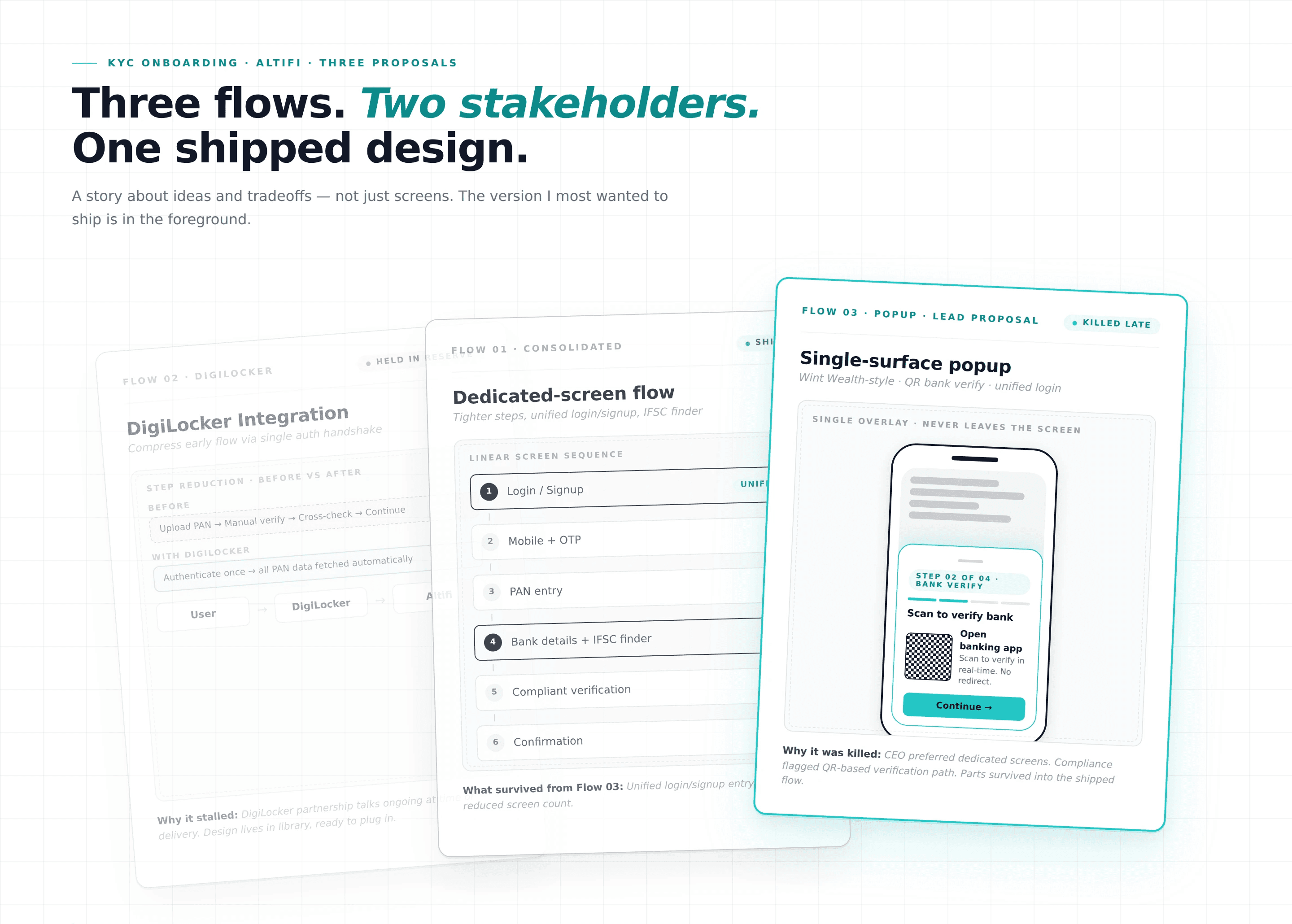
The existing flow had too many steps, was visibly dated next to competitors like Wint Wealth and Groww that had moved to lighter checkout-style onboarding, and was carrying drop-off the business wanted to address. I was asked to redesign it. Over the course of the project, I proposed three increasingly ambitious approaches, each one solving a real problem, each one losing pieces to different stakeholders, and each one leaving fingerprints on what eventually shipped.
02 — The Real Problem
Reducing drop-off without reducing trust
HOW MIGHT WE
…reduce drop-off in KYC without compromising the regulatory and trust guarantees that the flow exists to provide?
That question carries three frictions inside it:
One. The existing flow had too many sequential steps, each one gives a chance for users to drop off.
Two. Competitors had moved to integrated, single-surface onboarding that made our flow feel outdated by comparison.
Three. Regulatory steps like PAN, Aadhaar bank verification are non-negotiable in what must happen, but more flexible in how, and that flexibility was being underused.
03 — Role & Constraints
What I owned, and what was in the way
Role: Product Designer.
Timeline: 3 weeks across three flow explorations and final hand-off.
Team: 1 Product Manager · 2 Engineers · Compliance Head
Constraints: Compliance review came late in the process rather than as an upfront design partner. CEO-level review was a separate gate with its own considerations. DigiLocker integration was being explored in parallel by partnerships, with timeline uncertainty. Engineering effort was a real ceiling, proposals had to ship in actual sprint capacity.
04 — How I Approached It
Three proposals, in order
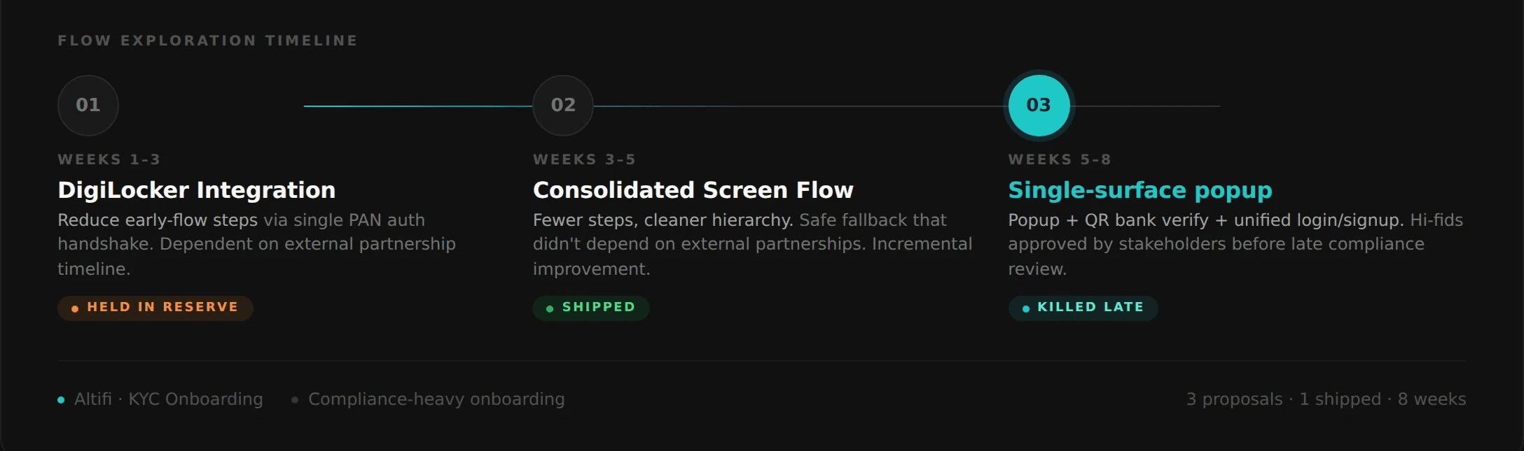
I made three proposals over the course of the project, each one solving a different scope of the problem. They didn't all ship but each one shaped what eventually did.
Proposal 01
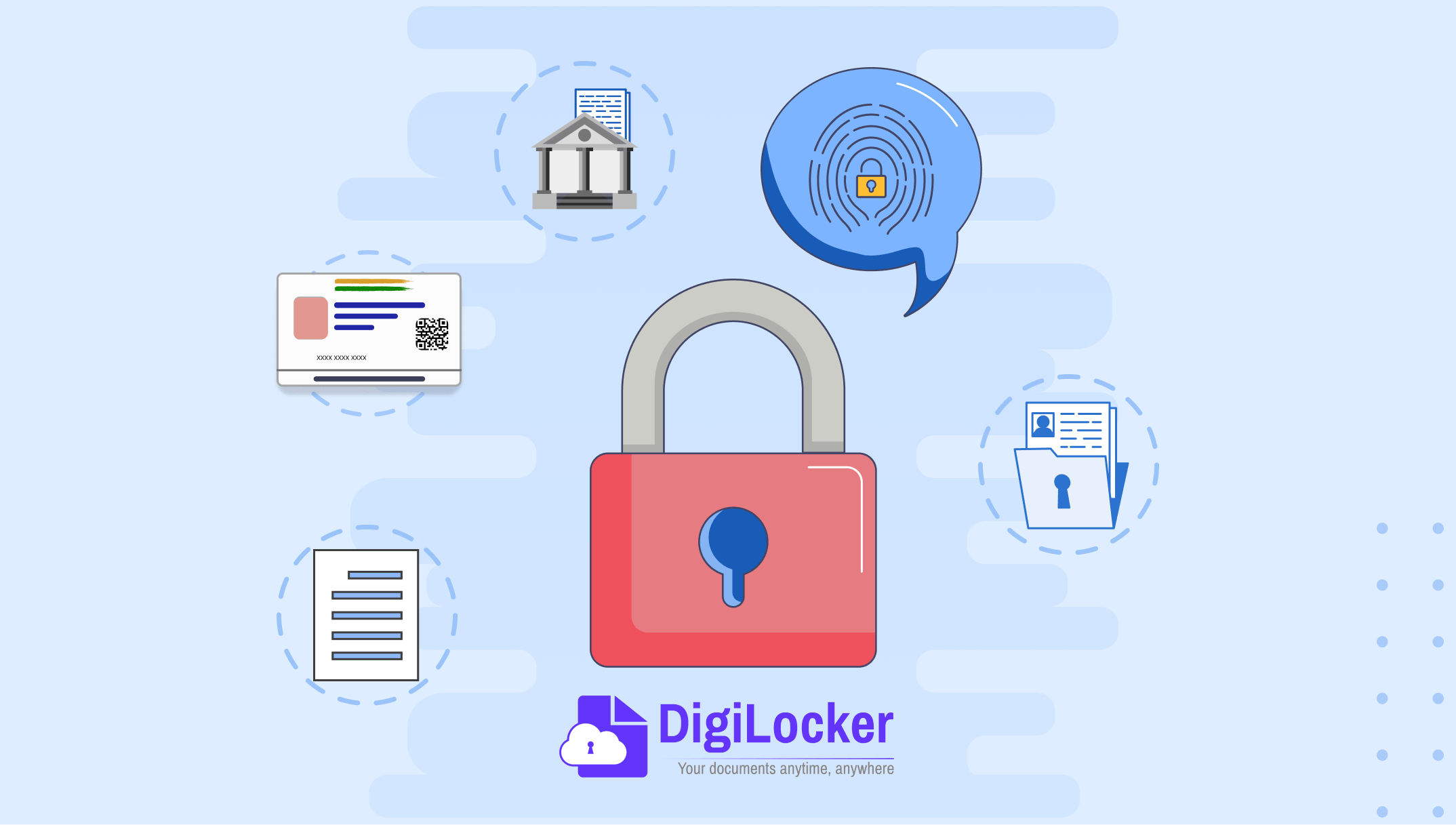
DigiLocker integration to compress the early flow
The first proposal leaned on a technical lever: integrate DigiLocker to fetch PAN details directly rather than asking users to upload them. This would have eliminated one of the heaviest friction points in the early flow, i.e. document upload and verification by replacing it with single authentication. I designed the flow around this assumption and prototyped the reduced step count.
The constraint surfaced quickly. Onboarding talks with DigiLocker were taking longer than expected on the partnerships side, and even if they concluded successfully, the integration would only compress the early portion of the flow and the rest of the journey would still carry its existing weight. I was solving for one segment and leaving the rest unchanged. The proposal wasn't wrong, but was incomplete.
Proposal 02
Minimal screen consolidation as a fallback
The second proposal was the safe answer. Rather than wait for DigiLocker, I designed a tighter version of the existing flow with the same architecture, fewer screens through consolidation and cleaner hierarchy. Engineering effort was minimal because the underlying steps didn't change. It was the version we could ship in weeks, not months.
I built it because the team needed a baseline that wasn't dependent on external partnerships. Yes, this flow was incremental, it would make the existing flow better but it still wouldn't change the kind of flow it was.
Proposal 03 (The one I believed in)
The popup, the QR verification, and the unified login/signup
The third proposal was the one I believed in, and it had three moves stacked together.
Collapse KYC into a popup-style surface: Inspired by Wint Wealth/ Groww's checkout-flow approach, the entire KYC sequence would happen on a single overlaid surface rather than a multi-screen journey, never making the user feel like they had left the main app. If DigiLocker eventually onboarded, it would slot cleanly into this same popup.
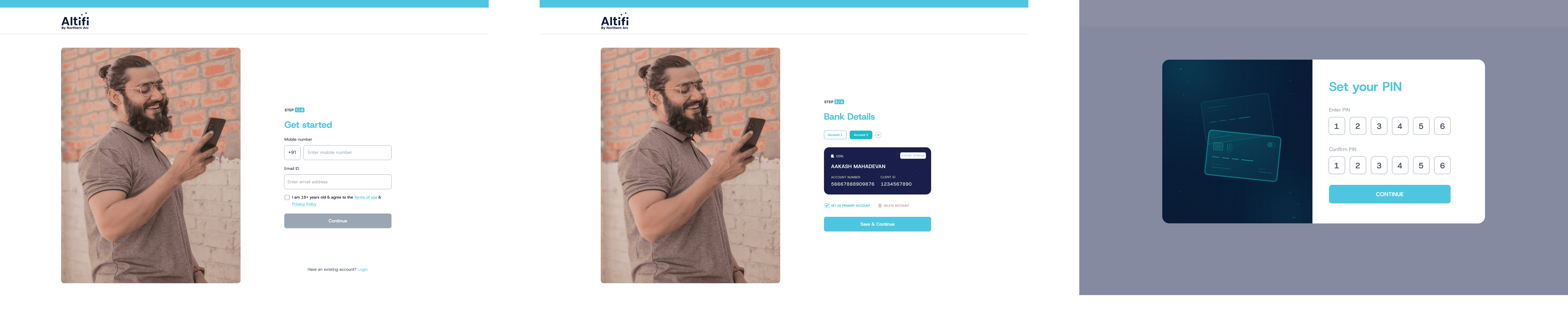
Unify login and signup into a single entry point: Rather than asking users upfront whether they were new or returning, the proposal was a single button that took the user's mobile number, checked existence in the background, and routed them into the appropriate flow without making them choose. One button, two destinations, zero friction at the decision point.
Real-time bank verification through QR-code handoff: Bank verification is typically the slowest step in KYC because it relies on penny-drop mechanisms or redirect chains. Instead, I proposed a QR handoff to the user's banking app, where verification could happen in real time and return cleanly to our flow. This was an inspired idea from an article I had read regarding KYC optimization. I was really proud, as this potentially would convert the slowest step in the journey into the fastest.

05 — The trade-offs
The Negotiations
The third proposal didn't ship in the form I designed it. Two separate stakeholder conversations reshaped it.
Business Head on the popup. Senior leadership reviewed Proposal 3 and pushed back on the popup format itself. The concern wasn't the flow but the experience: in their view, a pop up for a KYC journey, deserved a dedicated screen because of what it represented, like a moment of trust between the user and the platform. I disagreed at the time, and I still think the popup would have tested better on completion metrics.
The Business Head's framing wasn't unreasonable: the question of whether KYC should feel like a small quest or a milestone is a brand-experience decision, not just a UX one. We moved to a dedicated-screen architecture.
Compliance on the QR verification. Separately, compliance flagged the QR-based real-time bank verification as not meeting their interpretation of regulatory guidelines around how verification was initiated and logged. The technical approach was sound but the regulatory framework was not compliant. I rebuilt that segment with the compliant verification path.
What survived. The unified login/signup button: the small idea inside Proposal 3 survived both reviews intact and shipped on the dedicated-screen architecture. It was the move I thought would be flagged at the stakeholder review, and it landed cleanly. The lesson sat with me is that, the ideas that survive aren't always the ones you fight hardest for. Sometimes they're the ones nobody finds threatening.
The bigger lesson was structural. I had designed in parallel with compliance and brand stakeholders rather than with them. In a regulated, brand-sensitive product, that ordering matters more than any specific screen. If I were running this project again, I'd put compliance at the wireframe stage and Business Head at the concept stage, not at the hi-fid review.
06 — The Quiet Win
The detail that made the shipped flow better
One detail in the shipped flow came from UAT observation rather than any of the three proposals.
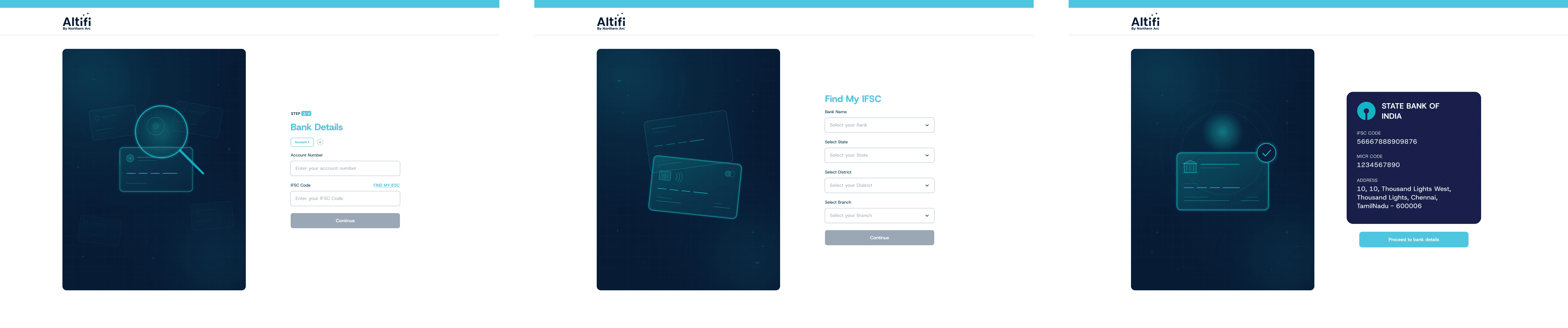
During usability testing on the bank-details screen, no user said they were struggling but we watched several of them pause, switch contexts, look up their IFSC code on a separate browser tab or banking app and return. None of them flagged it as a problem, they treated it as a normal cost of filling out a financial form.
I added an inline IFSC finder, which is a search-by-bank-and-branch component that surfaced the code without the user leaving the screen. It's a small addition. It saves maybe thirty seconds per user but it eliminated a context-switch that users had quietly accepted as inevitable. Some competitor flows have started implementing similar patterns since.
07 — Outcomes
What shipped, and what didn't
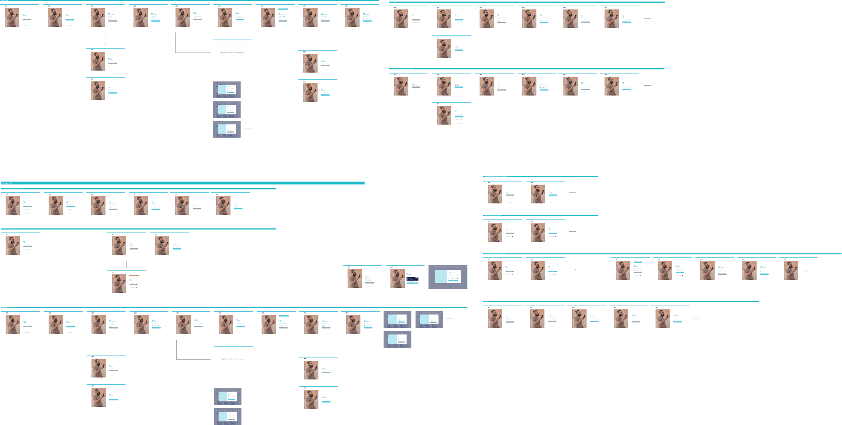
The shipped flow used the dedicated-screen architecture, the unified login/signup entry point, the existing compliant bank-verification path, and the inline IFSC finder. Screen count was reduced versus the original flow, the entry point removed an unnecessary user decision, the IFSC addition removed a silent friction point. Internal usability sessions before launch showed fewer points of hesitation across the early-flow steps.
The DigiLocker integration and the popup-based architecture remain in the team's design library as forward-looking references.
08 — What I'd Do Differently
Three lessons, in order of weight
01 Design with stakeholders, not for them.
The popup and the QR verification weren't killed because they were bad ideas, they were killed because I had designed them in parallel with compliance and CEO review rather than involving their perspectives at the concept stage.
02 Small ideas survive hard reviews.
The unified login/signup button cleared every obstacle, the bigger ideas didn't. Some of that is luck and some are low-threat ideas that don't trigger the same scrutiny as architectural ones.
03 Watch users, don't only listen to them.
The IFSC finder came from observation, not in the interview. It's a habit I want to keep sharpening for my future projects.
Want to know more about Altifi? Check out https://www.northernarc.com/altifi